Level 04 · Branding
Lumen Skin Clinic
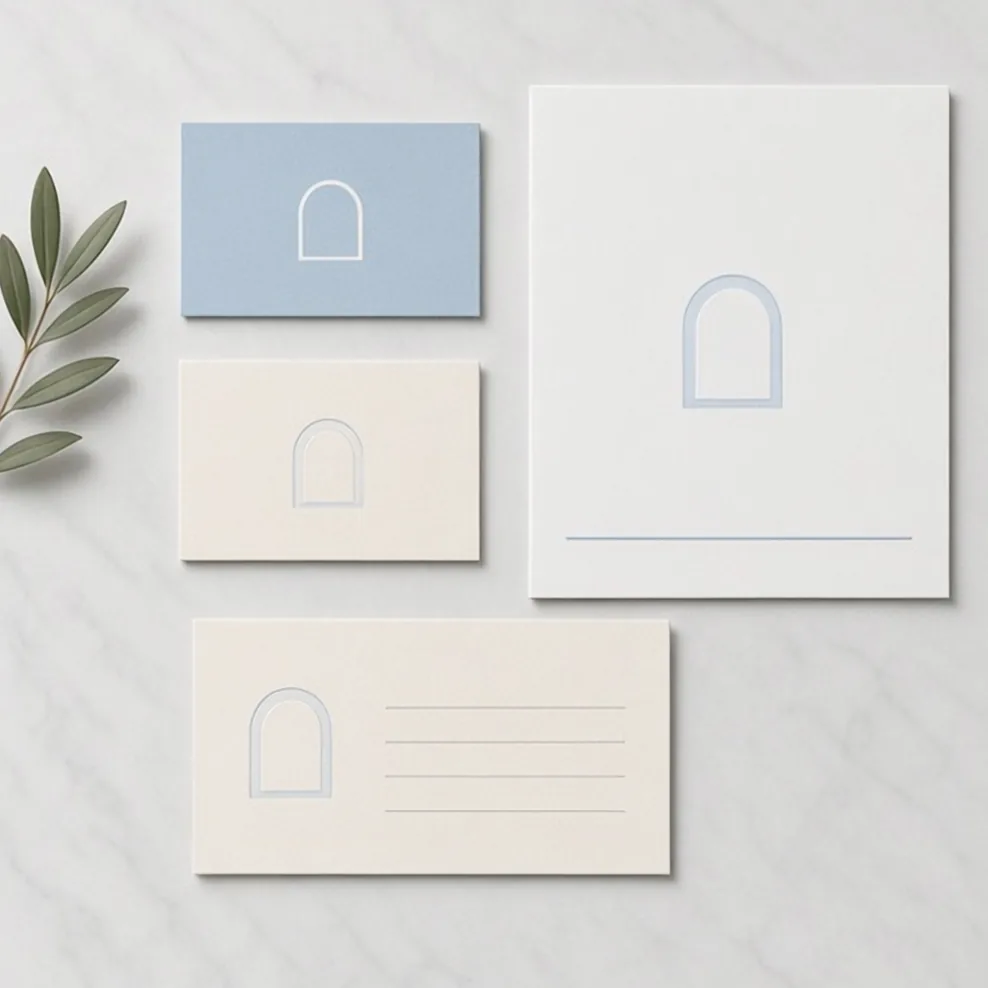
A calm, clinical-but-kind identity built around an open arch — a doorway to better skin.
- Client
- Lumen Skin Clinic
- Year
- 2024
- Role
- Brand identity, signage
- Discipline
- Branding
The challenge
Clinics in the area all looked either sterile or like beauty salons. Lumen wanted to feel medical and trustworthy, but gentle.
The solution
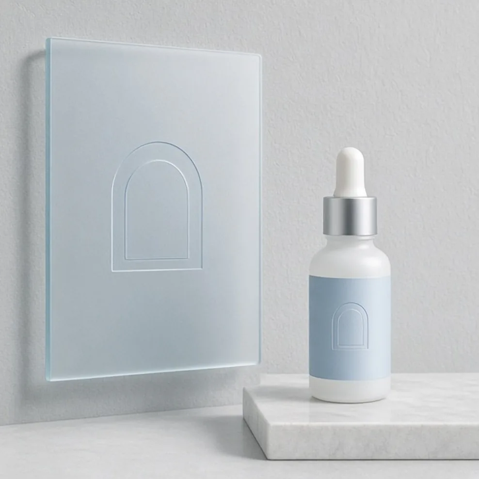
A soft arch symbol, powder-blue palette and generous white space. Signage uses frosted glass so the logo glows with daylight.
Deliverables
- Arch logo
- Stationery
- Signage
- Product labels
- Website UI kit
- Clinics rebranded
- 2
- Product labels
- 9
- Patient rating after launch
- 4.9★
Palette · click to copy